Design Resources

Artwork Guide

Art is the most personal decision you'll make in a room — and often the one people put off the longest. This guide walks through everything we consider when we're finishing a client's home: the styles that suit a space, the frames and materials worth investing in, and exactly where (and how high) each piece should live. Read it start to finish, or jump to the question that brought you here.

Pure Salt Shoppe - New Arrivals

01 // Choosing Art

Choose the feeling before the piece

The best artwork purchases start with a mood, not a wall measurement. Name how you want the room to feel — calm and misty, warm and sun-washed, quiet and collected — then let three questions narrow the search.

Focal point, or supporting layer?

Focal pieces earn a larger scale and quieter surroundings; supporting pieces can be smaller, more personal, and layered.

What will it live next to?

Art sits against your wall color, wood tones, and textiles — shop with the room in view.

Will you love it in ten years?

Trend-proof pieces share a restrained palette, a timeless subject, and quality framing.

02 // Find Your Style

The four styles we collect — and what each does for a room

Every piece in our collection falls into one of four families. Knowing what each contributes makes it easier to see what a room is missing.

Crashing Waves 1

Watercolor & Oils

Softness, movement, and hand-of-the-artist texture. Painted works read as calm and collected — the most forgiving style to live with long-term.

Buying Note: hand-embellished canvases cost more but carry real texture — worth it for focal walls.

Shop Watercolor & Oils
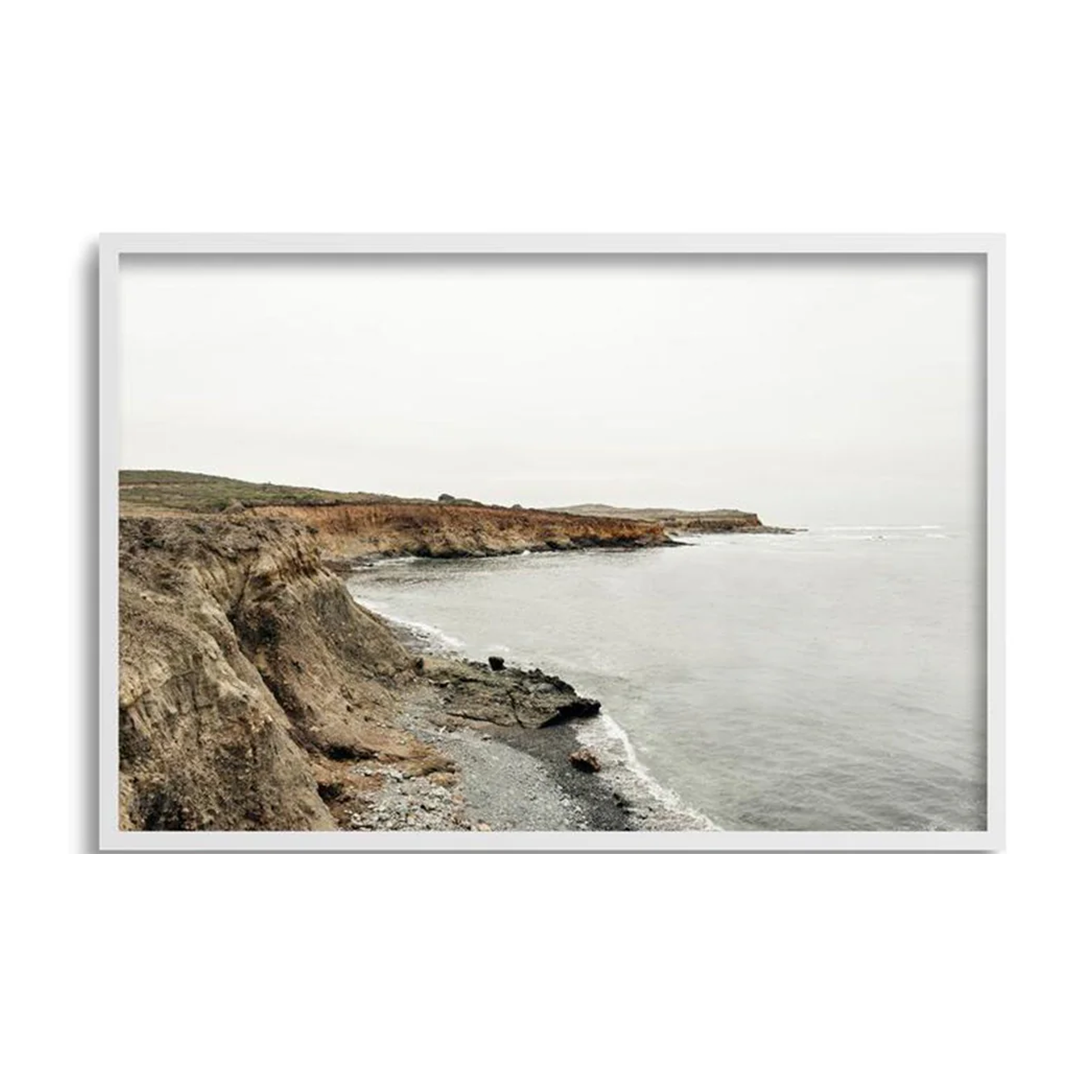
Moody Cliff

Photography

Realism, memory, and a sense of place. Photography grounds a home in landscape and feeling — the easiest way to make a space feel personal.

Buying Note: the most budget-flexible style; a smart entry point for a first "real art" purchase.

Shop Photography
Nobody Get Me II

Graphic Prints

Structure and a modern edit. Line work and muted geometry add rhythm to rooms heavy in texture and neutrals.

Buying Note: the lowest-commitment way to test a bolder palette before investing bigger.

Shop Graphic Prints
Caballero Artwork - Pure Salt

Framed Objects

Dimension and story. Framed textiles, botanicals, and found objects behave like sculpture for the wall.

Buying Note: check the listed frame depth — shadow boxes sit off the wall in a way flat photos don't show.

Shop Framed Objects
Leftbank Art Brushed Country II

Only at Pure Salt

Exclusive Artwork

A curated expression of Pure Salt's coastal sensibility, bringing together the textures, landscapes, and artistic mediums we're continually drawn to. From serene seascapes and organic abstracts to richly layered mixed media, each piece is thoughtfully selected to add warmth, depth, and a collected feel to the home.

Buying Note: meant to be paired together, shop within the collection to curate your perfect gallery.

Pure Salt x Leftbank Art

03 // Frames & Materials

Frames & materials: what you're really choosing

Two pieces can share a subject and palette and still feel completely different on the wall. The difference is the build — and each choice changes the look, the lifespan, and the price.

Surfaces

Canvas

Matte, textural, glare-free. Ideal for large pieces and sunnier rooms.

Fine art (giclée) paper

Rich detail under glazing; hand-deckled edges add a collected feel.

Acrylic glass

Luminous, frameless, saturated. Heavier; anchor well.

Hand-embellished prints

Artist-applied paint over giclée — original texture at a gentler price.

Frames

Natural white oak & light woods

Our coastal default — warm, quiet, cohesive across a gallery wall.

Thin gallery frames

Crisp definition for photography and prints; black adds contrast.

Float frames

The canvas hovers inside a shadow gap — an elevated gallery look.

Vintage & carved frames

One ornate frame among simple ones feels collected over time.

Mats & Glazing

Wide mats

Give small works presence — a 16x20 print in a 24x30 matted frame reads far more substantial.

UV-filtering acrylic

Lighter and safer than glass; protects paper works from coastal sun.

When to skip glazing

Canvas and acrylic-glass pieces need none — one reason they suit bright walls.

04 // Size & Placement

Get the size and height right

Thoughtful scale and placement are just as important as the artwork itself. Whether anchoring a room with a statement piece or layering smaller works for a collected look, the right proportions help create balance, warmth, and visual interest throughout the home.

2/3

Art should span two-thirds to three-quarters the width of the furniture below.

57–60"

Hang so the center of the piece — or grouping — sits at eye level.

6–10"

Between the furniture top and the frame, so they read as one composition.

2–3"

Between frames in any pair, triptych, or gallery wall.

Bigger

Undersized art is the mistake we correct most. One generous piece beats three small ones.

05 // Hanging

Five ways to design with art

01

The Gallery Wall

A collected mix of sizes and styles, kept cohesive by a two-part rule: repeat a palette across every piece, and keep frames within one family. Lay it out on the floor first, anchor the largest piece just off-center, and mix in one framed object so it feels gathered over time — not bought in a day.

Best for: stairways, family rooms, hallways & offices

02

Above the Mantle

The most-seen wall in the house deserves one confident piece — roughly two-thirds the mantle's width, hung 4–8 inches above the shelf (lower than instinct suggests). Or skip hooks entirely: lean one large piece and layer a smaller frame in front, overlapping a corner.

Best for: large landscapes & abstracts

03

Leaned Layers

The most effortless look in the coastal playbook — and renter-friendly. Lean a larger piece against the wall, overlap a smaller frame in front of one corner, then balance the opposite end with a vase or a stack of books. On open shelving, alternate leaning frames with objects so the art breathes.

Best for: entries, sideboards, bookcases & dressers

04

Pairs & Triptychs

Series art — like Fruiting Florals or Tide & Stone — hung in twos and threes brings order and rhythm. Keep frames identical, spacing exact, center at 57–60 inches. A vertical pair suits narrow walls; a horizontal triptych stretches beautifully over a long credenza or dining wall.

Best for: dining rooms, headboard walls & hallway runs

05

Above the Bed

Choose calm over drama: tonal abstracts, soft landscapes, or a serene pair. Size it to the headboard, hang 6–8 inches above, and use two anchor points or a security hanger — practical peace of mind, especially in California.

Best for: muted statements, expansive tranquil scenes

06 // Rooms

Where every room should start

Entry

One leaned piece on a console sets the tone for the whole house. Framed objects shine here.

Living Room

Your largest investment piece over the sofa or mantle; echo its palette in pillows and throws.

Dining Room

A horizontal landscape or matched pair at 57" center — art you can enjoy while seated.

Bedroom

Tonal and calm above the bed; something small and personal on the dresser.

Bath & Powder

Small prints under acrylic glazing. Powder rooms can take the boldest piece in the house.

Kitchen & Office

Petite prints leaned on counters and shelves make working rooms feel considered.

Pure Salt Shoppe - New Arrivals

Shoppe Design

Not sure what art to choose?

Book a Shoppe Design consultation and our team will select, size, and place every piece for you — art included.

Book a consult

07 // Care

Keep it beautiful

Sunlight is gorgeous, but unforgiving. Keep paper works out of direct sun or behind UV-filtering glazing, and give canvas and acrylic pieces the brighter walls. Dust frames with a dry microfiber cloth. In bathrooms and beach-adjacent homes, choose acrylic over glass and check hardware yearly — salt air is hard on metal.

08 // Frequently Asked Questions

How do I choose artwork for my home?

Start with the feeling you want the room to have, then work through four filters: style (painted, photographic, graphic, or dimensional), palette (echo at least one major tone already in the room), scale (two-thirds the width of the furniture below), and build (canvas for bright walls, framed paper for detail). If a piece passes all four and you'd miss it if it were gone — buy it.

How high should I hang artwork?

Hang art so its center sits 57 to 60 inches from the floor. Over furniture, leave 6–10 inches between the furniture and the frame; over a mantle, 4–8 inches. For groupings, treat the whole arrangement as one piece and center it at the same height.

What size art should go above a sofa?

Two-thirds to three-quarters of the sofa's width. A single generous piece almost always beats three small ones.

What's the difference between canvas and framed prints?

Canvas is matte, textural, and glare-free — best for large pieces and bright rooms. Framed paper prints offer finer detail and a more classic, collected look, but need glazing and gentler light. Acrylic-glass pieces are the sleek, high-saturation modern option.

How do I make a gallery wall look cohesive?

Repeat one palette across every piece and keep frames within a single family, then vary sizes and subjects freely. Space frames 2–3 inches apart, anchor the largest piece slightly off-center, and add one unexpected element — a framed object or vintage-style frame — so it feels collected, not kitted.

Can I lean art instead of hanging it?

Yes — leaning is the most effortless look in the coastal playbook, and it is renter-friendly. Lean a larger piece against the wall, overlap a smaller frame in front of one corner, and balance the opposite end with an object.

Start collecting

Find the piece that feels like home

Every work in our collection is chosen the way we design for clients — for palette, texture, and the way it will live in a real home.